Layout
A consistent layout that adapts across display sizes, orientations, and multitasking configurations helps people understand and enjoy your app or game on all their devices.

Your layout provides the structure for people to understand your content from the moment they open your app. Familiar relationships between controls and content let people use and discover features right away, and make your design feel at home on every platform.
Apple provides templates and layout guides that can help you integrate Apple technologies and design your apps and games to run on all Apple platforms. See Apple Design Resources.
Visual hierarchy
Order content by relative importance. People often start by viewing content in reading order — that is, from top to bottom and from the leading to trailing side — so place the most important items near the top and leading side of the window or display. To support right-to-left languages, prefer standard system components that can automatically adapt UI elements to better reflect each language’s natural reading order. For guidance, see Right to left.
Align elements to make them easier to scan, and use indentation to convey hierarchy. Alignment makes an app look neat and organized, and can help people track content while scrolling or moving their eyes. People assume that aligned items are related to each other, and conversely, they perceive indented items as subordinate to the item they follow. Because of this, using alignment and indentation deliberately can help people understand your information hierarchy.
Group related items to clearly express related information or functions. For example, you might use negative space, container shapes, or separator lines to show which elements are related and which are unrelated.
Use progressive disclosure to make layouts cleaner and easier to interact with. An interface with too much content and too many choices makes it harder to find information quickly, and harder to understand the choices that are available. Use disclosure triangles, menus, or nested views to reduce how much content to initially display; or use scrollable sections to showcase additional content, which is particularly useful for media-focused apps like those for video, music, or books.
Differentiate controls from content. Take advantage of the Liquid Glass material on all platforms that support it to provide a distinct appearance for your controls. Instead of applying a solid or semi-opaque background color beneath controls, use a scroll edge effect to visually elevate controls above content. For guidance, see Scroll views. For full-screen background content, be sure to extend it underneath sidebars, toolbars, and tab bars to fit the entire screen or window.
If scaling a background image to the full window edge results in components like sidebars or inspectors covering important parts of the image, you can use a background extension effect to flip and blur the image, mirroring it beneath adjacent components and providing the appearance that the background image extends beneath them. For developer guidance, see backgroundExtensionEffect() and UIBackgroundExtensionView.

Adaptability
Apps and games need to adapt to different display sizes, orientation changes, window sizes, and multitasking states. In iOS, iPadOS, tvOS, and visionOS, the system defines characteristics of the device environment that can affect the way your app or game looks. Use SwiftUI or Auto Layout to ensure that your interface adapts to them.
Here are some of the most common device and system characteristics that apps need to handle:
Regular and compact horizontal and vertical size classes
Different device screen sizes
Different device orientations and aspect ratios
System features like the Dynamic Island
External display support, Display Zoom, and resizable windows on iPad and Mac
Text-size changes
Locale-based internationalization features like left-to-right/right-to-left layout direction, date/time/number formatting, font variation, and text length
Design a layout that adapts gracefully and consistently. People expect your experience to remain familiar when they rotate their device, resize a window, add another display, or switch to a different device. You can help ensure an adaptable interface by respecting system-defined safe areas, margins, and guides (where available) and specifying layout modifiers to fine-tune the placement of views in your interface.
Even if your app is locked to a certain orientation, such as a landscape-only game, it’s still important to ensure your interface resizes well to provide the best experience across devices and window sizes.
Be prepared for text-size changes. People use Dynamic Type to increase text size to be more readable, which occurs at the system level. Apps that don’t respond to this setting can be difficult or impossible to use for people who rely on this feature. Support Dynamic Type by adjusting your layout to accommodate text at larger sizes. For example, horizontally adjacent views may need to stack vertically to provide more space for text; table rows or other containers may need to grow in height so that text isn’t cropped or doesn’t overlap other content; and table rows with a single line of text by default might need to grow vertically to accommodate multiple lines of text.
To support Dynamic Type in your Unity-based game, use Apple’s accessibility plug-in (for developer guidance, see Apple – Accessibility). For guidance on displaying text in your app, see Typography.
Preview your app on multiple devices, using different size classes, localizations, and text sizes. You can streamline the testing process by first testing versions of your experience that use the largest and the smallest layouts. You can test on a simulated device in Device Hub to check for clipping and other layout issues. For example, you can use Device Hub to make sure your layout looks great when your app is resized on iPad or in iPhone Mirroring on Mac.
When necessary, scale background artwork in response to display changes. Viewing your app or game in a different context — such as on a screen with a different aspect ratio — might make your artwork appear cropped, letterboxed, or pillarboxed. If this happens, don’t change the aspect ratio of the artwork; instead, scale it so that it fills the screen completely. Note that since windows can be very wide and short or tall and narrow, background artwork may often need to extend beyond what is typically visible in a more standard display aspect ratio.
Size classes
In iOS and iPadOS, size classes are an indication of how much horizontal and vertical space is available to an app’s interface.
Each dimension — horizontal and vertical — is represented by one of two size classes: compact or regular. The horizontal size class determines whether an app is narrow (compact) or wide (regular), while the vertical size class determines whether it is short (compact) or tall (regular).
The system sets size classes based on the device type, window configuration, and multitasking state; for example, whether an app is full screen, in Slide Over, or mirrored from an iPhone to a Mac. Depending on their environment, iOS and iPadOS apps can exist in every combination of size classes.

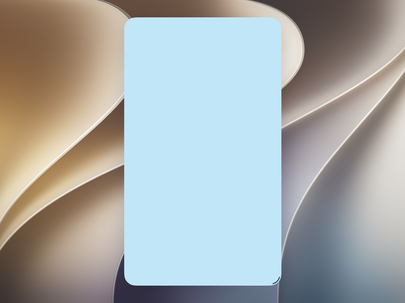
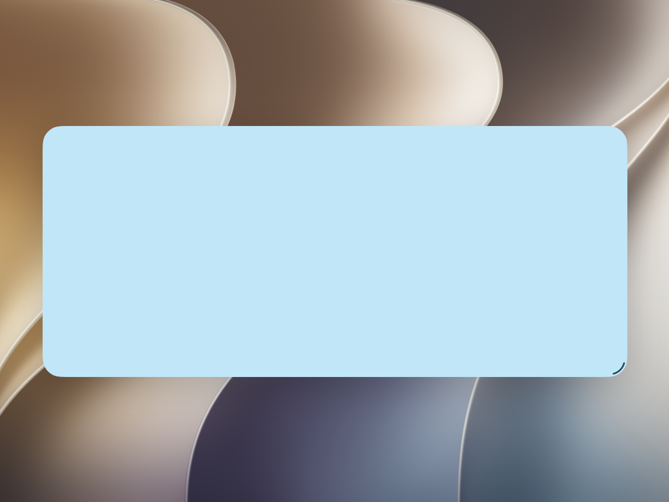
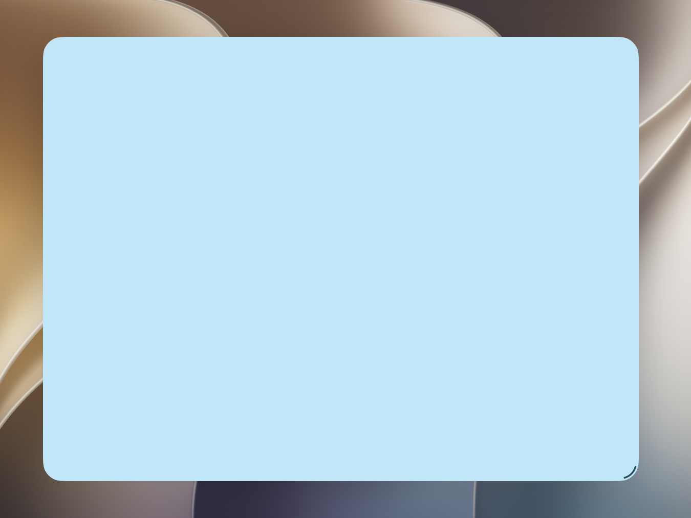
For developer guidance, see UITraitChangeObservable and UserInterfaceSizeClass.
Determine layout based on size classes, not device type or orientation. Size classes describe the actual space available, regardless of whether an app is in portrait or landscape. Conversely, a device’s orientation and type (also called its idiom) aren’t useful for making layout decisions because they don’t provide your app with information about how much space is available.
Size classes also let your app’s interface adapt to a wide range of window sizes. For example, when a person runs your app in macOS with iPhone Mirroring, they can freely resize its width and height; or they can resize an iPad app when multitasking in iPadOS or when running it in macOS.
Consider all possible combinations of size classes. Your app can appear in a variety of size classes in both portrait and landscape aspect ratios, and it’s important to consider all of them to provide a good experience. A layout solely designed for landscape on iPhone with regular width and compact height might not take advantage of the vertical space available on iPad in landscape when someone resizes the window to regular height. Conversely, designing exclusively for compact portrait could leave extra space when someone resizes the app window to a regular width on iPad.
Keep functionality the same as size classes change, and keep layout changes recognizable and familiar to the platform. Don’t change your app’s functionality based on the space it occupies. However, you can change the amount of functionality that’s visible onscreen as the amount of space changes. Consider taking advantage of larger spaces to switch from a tab bar to a sidebar or expose functionality that might otherwise be grouped into an overflow menu.
Similarly, while an app’s size classes might change when someone resizes it, its idiom — the device type it’s made for — remains the same: keep the layout recognizable and familiar to the platform even when resizing.
Guides and safe areas
A layout guide defines a rectangular region that helps you position, align, and space your content on the screen. The system includes predefined layout guides that make it easy to apply standard margins around content and restrict the width of text for optimal readability. You can also define custom layout guides. For developer guidance, see UILayoutGuide and NSLayoutGuide.
A safe area defines the area within a window that isn’t covered on the edge by a hardware feature or another view within the window, like a toolbar, tab bar, or status bar. Respecting the safe area is essential to make sure system UI and hardware features like the Dynamic Island don’t obstruct content and controls. For developer guidance, see SafeAreaRegions and Positioning content relative to the safe area.
Platform considerations
No additional considerations for iOS or iPadOS.
macOS
Avoid placing controls or critical information at the bottom of a window. People often move windows so that the bottom edge is below the bottom of the screen.
Avoid displaying content behind the camera housing at the top edge of the window. For developer guidance, see NSPrefersDisplaySafeAreaCompatibilityMode.
tvOS
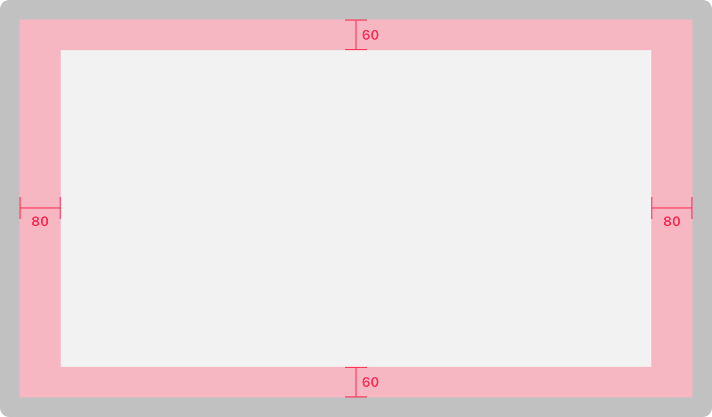
Adhere to the screen’s safe area. Inset primary content 60 points from the top and bottom of the screen, and 80 points from the sides. Providing these margins ensures your content is visible regardless of TV compatibility settings or overscan cropping.
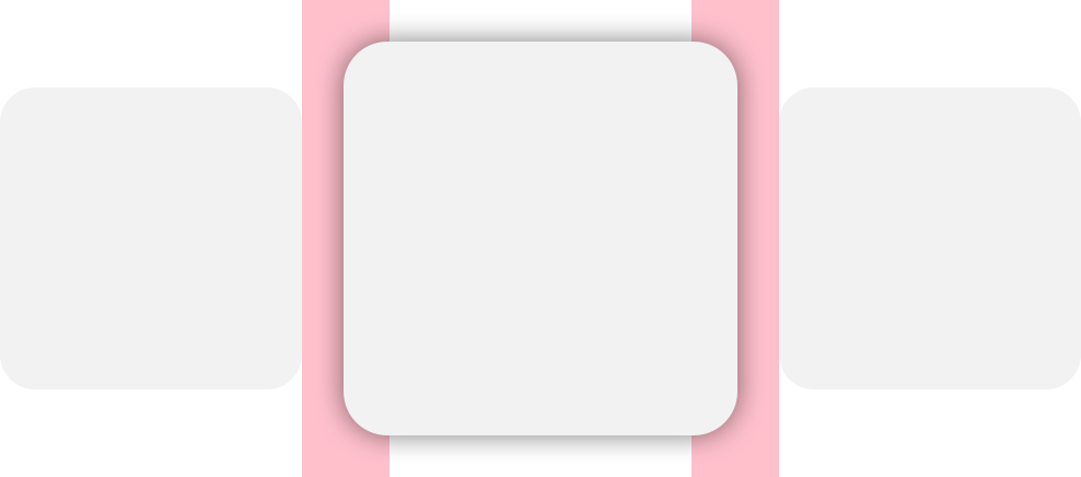
Include appropriate padding between focusable elements. When you use UIKit and the focus APIs, an element gets bigger when it comes into focus. Consider how elements look when they’re focused, and make sure you don’t let them overlap important information. For developer guidance, see About focus interactions for Apple TV.
Grids
The following grid layouts provide an optimal viewing experience. Be sure to use appropriate spacing between unfocused rows and columns to prevent overlap when an item comes into focus.
If you use the UIKit collection view flow element, the number of columns in a grid is automatically determined based on the width and spacing of your content. For developer guidance, see UICollectionViewFlowLayout.
Two-column
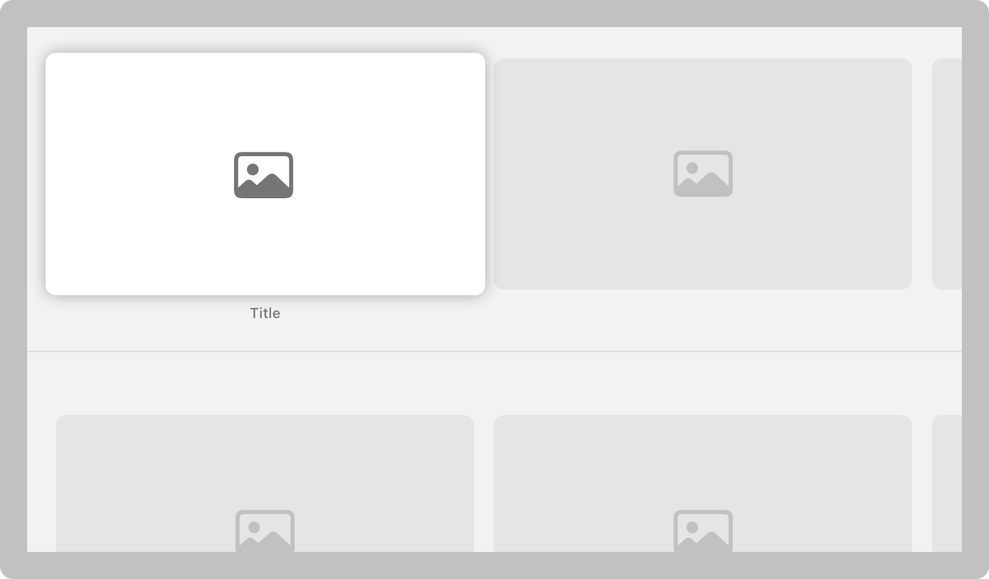
Two-column grid
| Attribute | Value |
|---|---|
| Unfocused content width | 860 pt |
| Horizontal spacing | 40 pt |
| Minimum vertical spacing | 100 pt |
Three-column
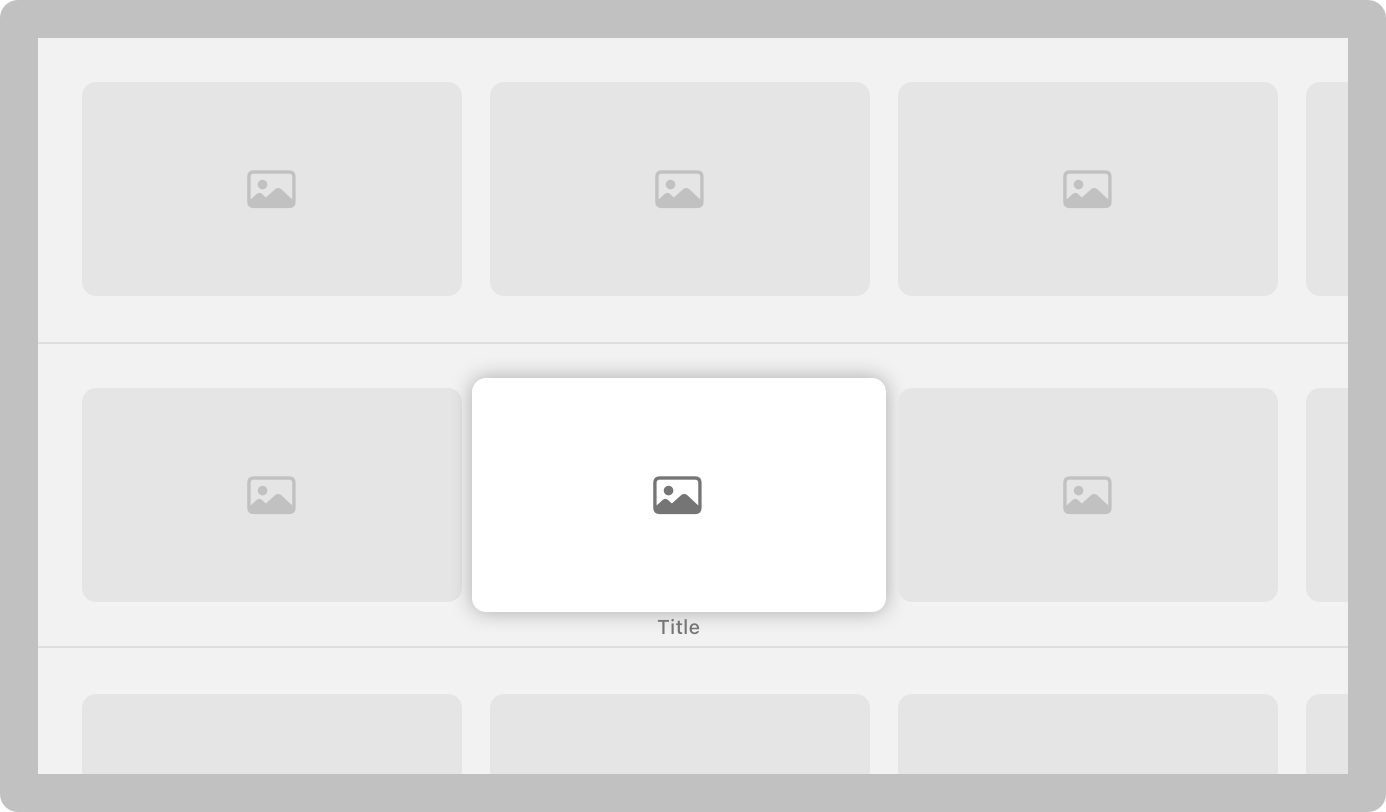
Three-column grid
| Attribute | Value |
|---|---|
| Unfocused content width | 560 pt |
| Horizontal spacing | 40 pt |
| Minimum vertical spacing | 100 pt |
Four-column
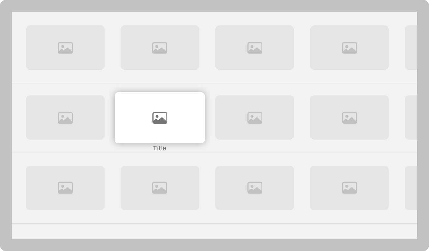
Four-column grid
| Attribute | Value |
|---|---|
| Unfocused content width | 410 pt |
| Horizontal spacing | 40 pt |
| Minimum vertical spacing | 100 pt |
Five-column
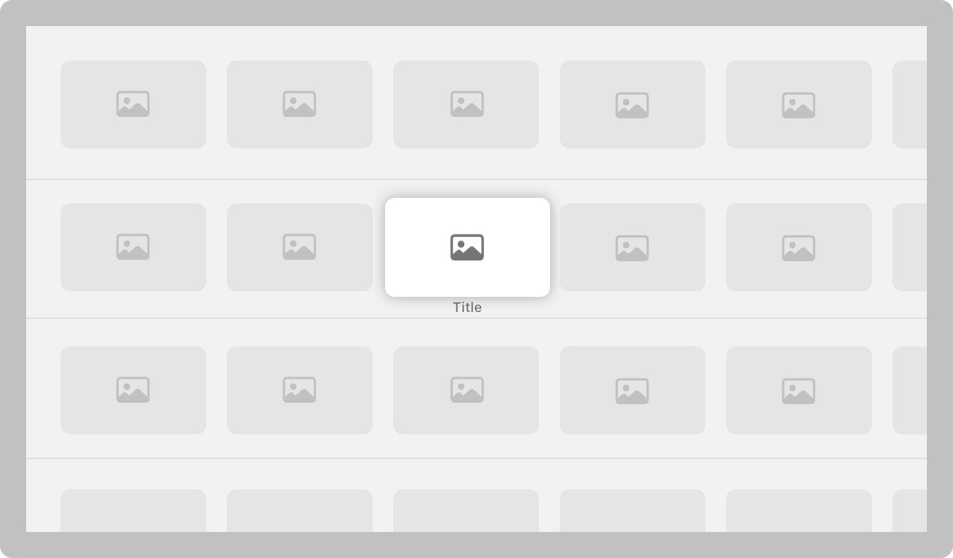
Five-column grid
| Attribute | Value |
|---|---|
| Unfocused content width | 320 pt |
| Horizontal spacing | 40 pt |
| Minimum vertical spacing | 100 pt |
Six-column
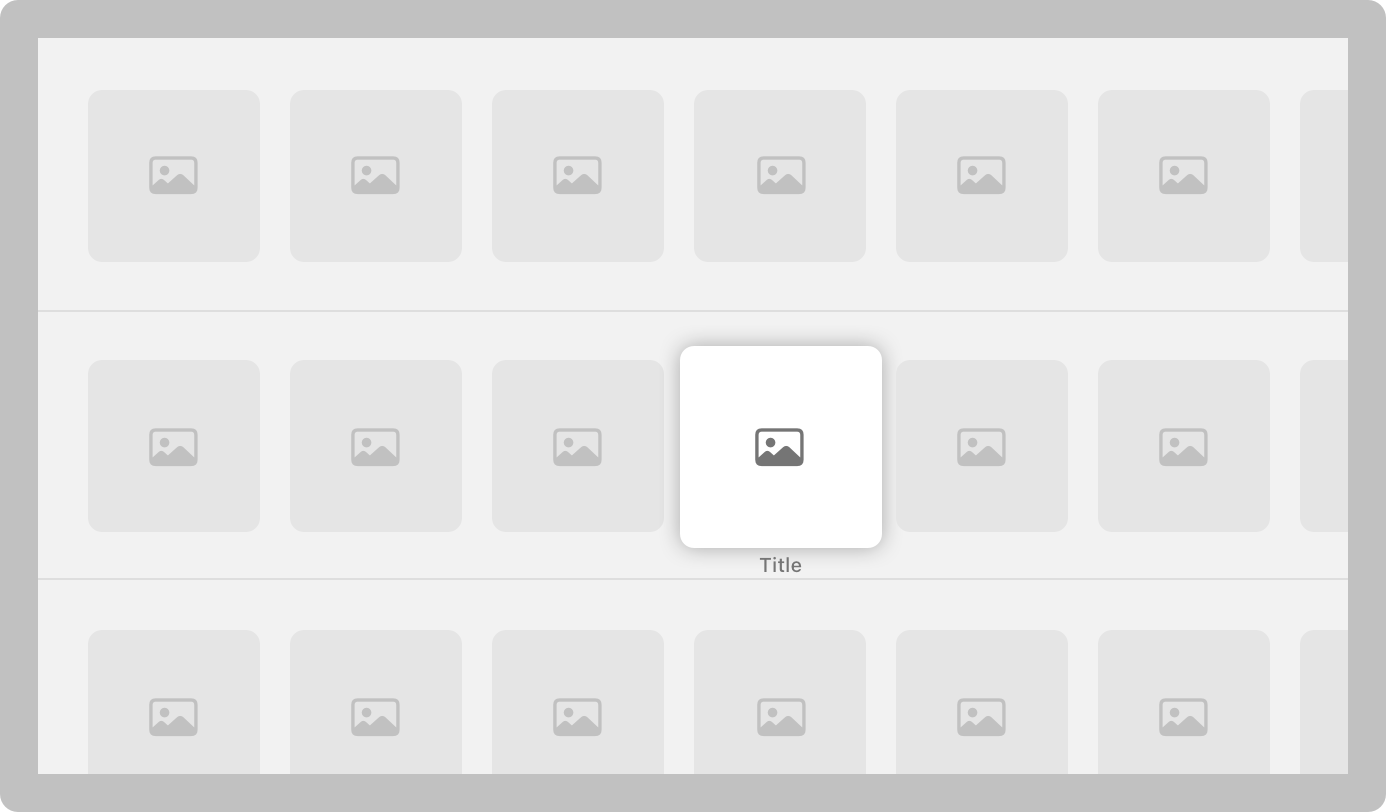
Six-column grid
| Attribute | Value |
|---|---|
| Unfocused content width | 260 pt |
| Horizontal spacing | 40 pt |
| Minimum vertical spacing | 100 pt |
Seven-column
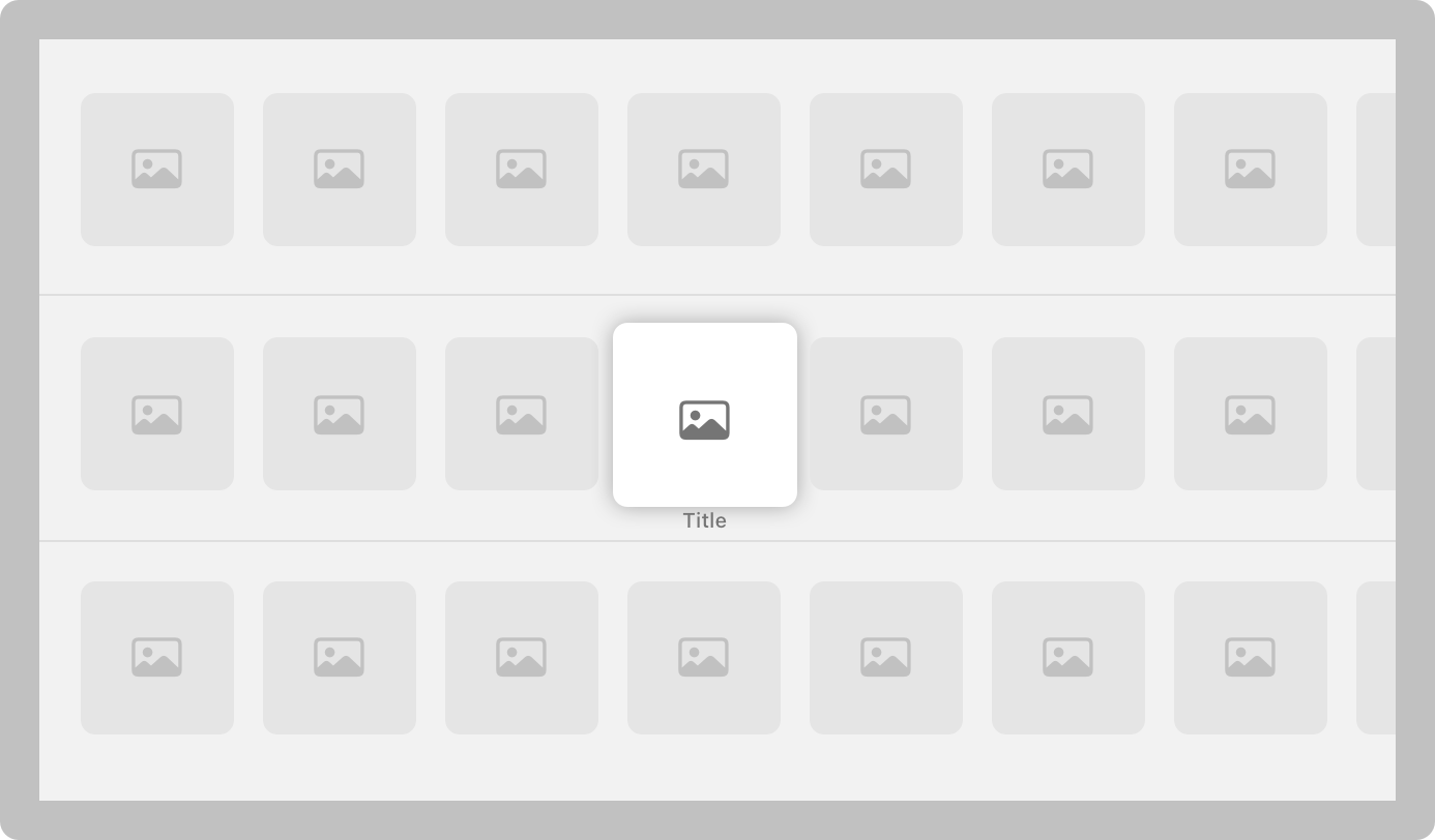
Seven-column grid
| Attribute | Value |
|---|---|
| Unfocused content width | 217 pt |
| Horizontal spacing | 40 pt |
| Minimum vertical spacing | 100 pt |
Eight-column
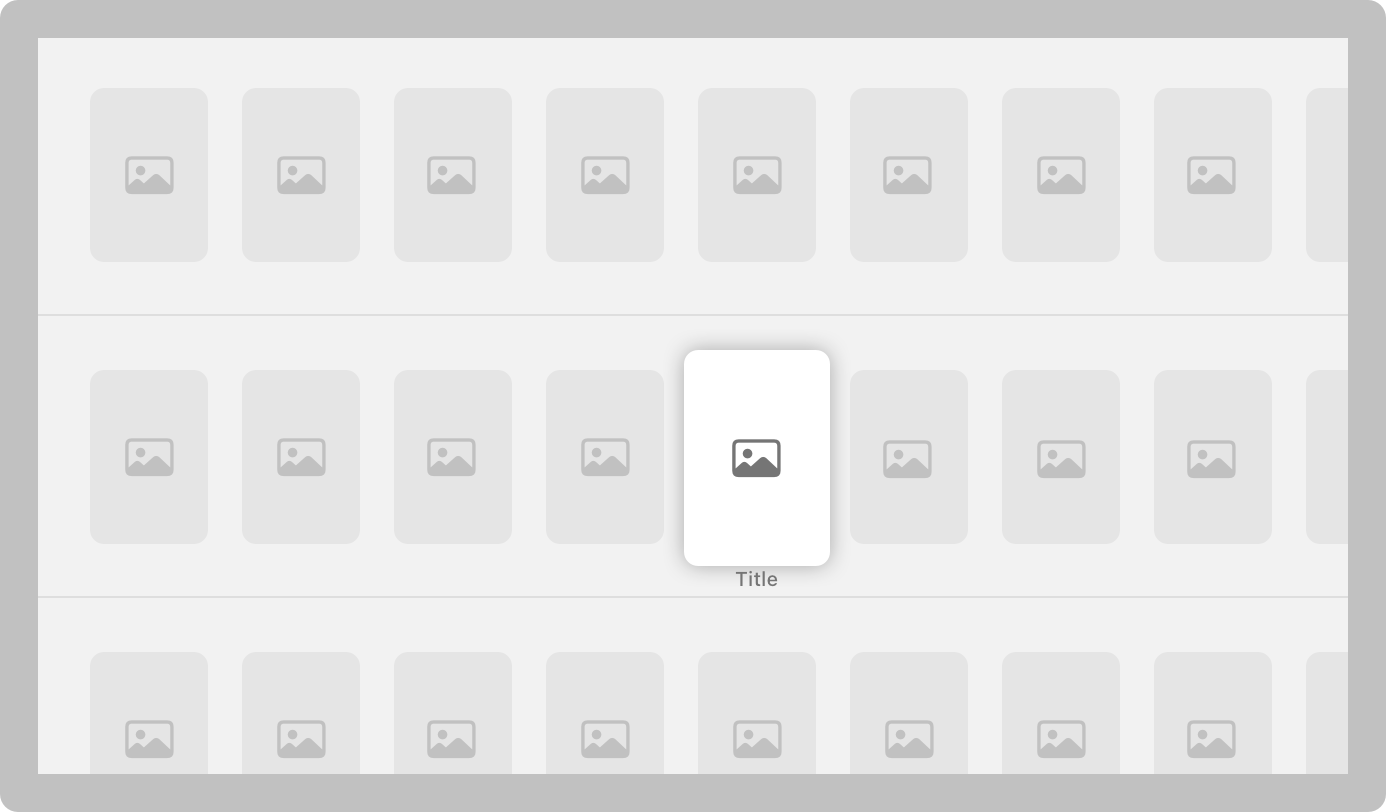
Eight-column grid
| Attribute | Value |
|---|---|
| Unfocused content width | 184 pt |
| Horizontal spacing | 40 pt |
| Minimum vertical spacing | 100 pt |
Nine-column
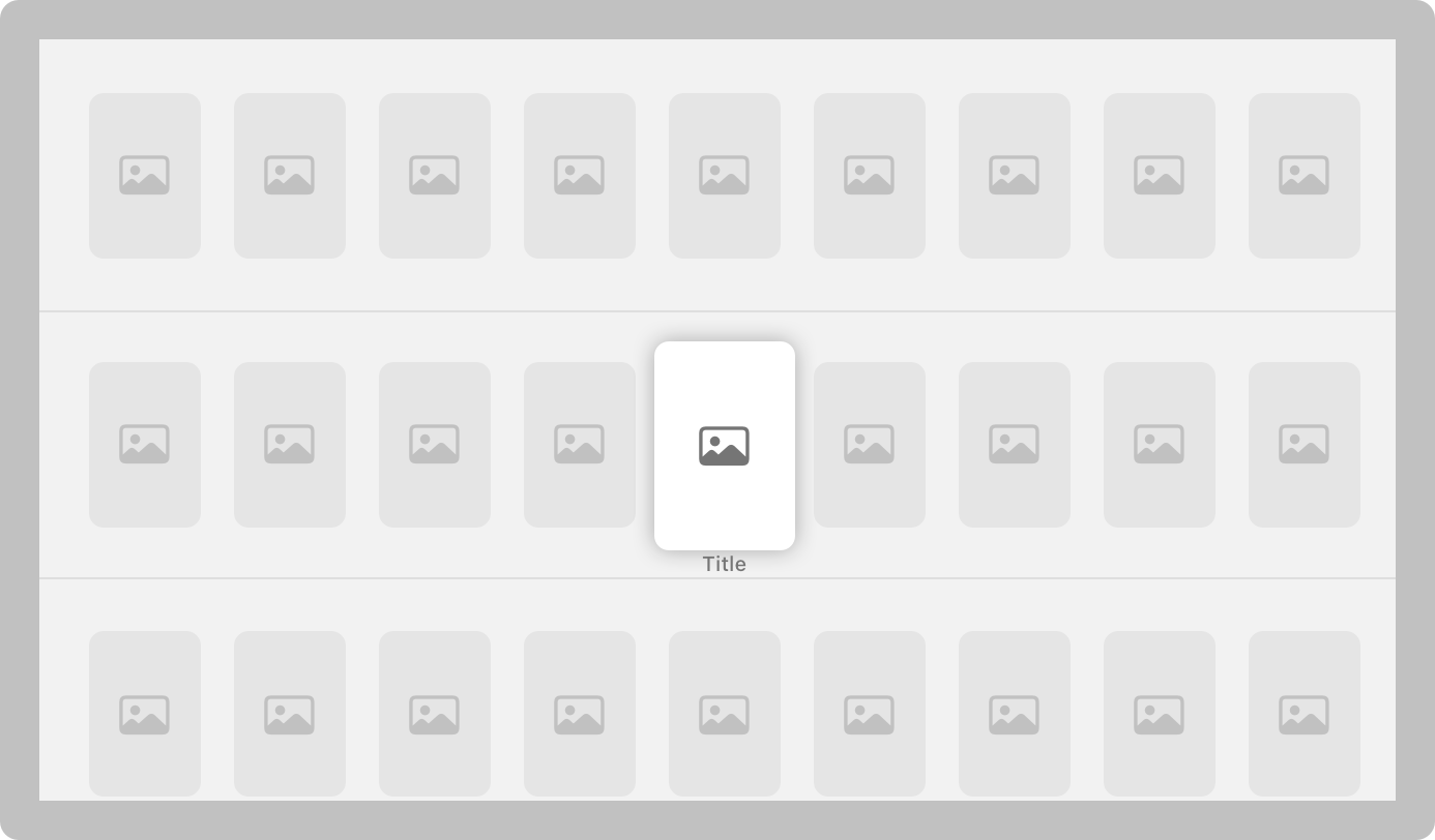
Nine-column grid
| Attribute | Value |
|---|---|
| Unfocused content width | 160 pt |
| Horizontal spacing | 40 pt |
| Minimum vertical spacing | 100 pt |
Include additional vertical spacing for titled rows. If a row has a title, provide enough spacing between the bottom of the previous unfocused row and the center of the title to avoid crowding. Also provide spacing between the bottom of the title and the top of the unfocused items in the row.
Use consistent spacing. When content isn’t consistently spaced, it no longer looks like a grid and it’s harder for people to scan.
Make partially hidden content look symmetrical. To help direct attention to the fully visible content, keep partially hidden offscreen content the same width on each side of the screen.
visionOS
In visionOS, you can lay out content within a window, a bounded 3D volume, or an immersive space. The guidance below focuses on laying out content in a window or volume; for guidance on displaying content spatially and best practices for using depth, scale, and positioning, see Spatial layout. To learn more about windows and volumes in visionOS, see Windows > visionOS.
In general, support resizing. The ability to resize windows and volumes is standard behavior in visionOS, just as in macOS and iPadOS. When you allow resizing, make sure your layout adapts well as it changes size, and prefer to keep content horizontally centered at very large sizes so people can easily view and interact with it.
You can also choose to set a minimum and maximum size for windows, volumes, and attached UI elements like ornaments. Use these settings to keep elements from overlapping at small sizes, and to keep large layouts from becoming too unwieldy; but don’t use minimum and maximum sizes as a way to prevent resizing. For example, in Safari, people can resize browser windows, but the custom navigation bar ornament has a fixed maximum size so that controls remain easy to access. For developer guidance, see Positioning and sizing windows.
Use 3D content sparingly in windows. While windows in visionOS can display 3D content at a fixed depth, reserve this for meaningful moments alongside 2D content. For example, an educational app might display an inline 3D model of a rocket next to information about the model. When displaying 3D content inline, place it inset in the window to avoid it colliding with other content or controls, or appearing unpredictably outside the window edge.
To display larger models or views that primarily consist of 3D content, consider using a volume or placing content in an immersive space.
Display supplemental content in an adjacent window, not in an ornament. While ornaments are flexible enough to act as custom components, they are best for app-specific interactive controls like toolbars and video playback controls, not supplemental content. To display a supplemental content view, open a new window next to the current one using defaultWindowPlacement(_:) instead of placing the content in an ornament. For developer guidance, see Positioning and sizing windows.
Include enough space around controls for them to be easy to interact with. Put enough space around controls to make them clearly identifiable, and to prevent the system-provided hover effect from obscuring other content. For example, place buttons so their centers are at least 60 points apart. For guidance, see Eyes, Spatial layout, and Buttons > visionOS.
watchOS
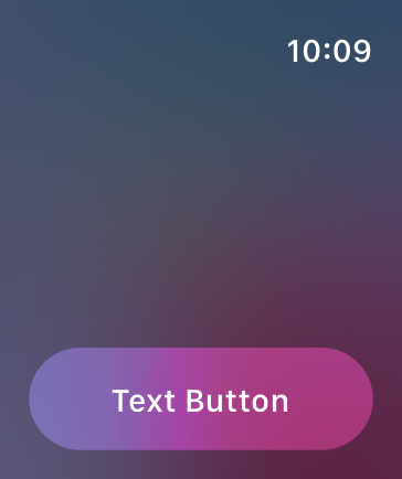
Avoid placing more than two or three controls side by side in your interface. As a general rule, display no more than three buttons that contain glyphs — or two buttons that contain text — in a row. Although it’s usually better to let text buttons span the full width of the screen, two side-by-side buttons with short text labels can also work well, as long as the screen doesn’t scroll.
Support autorotation in views people might want to show others. When people flip their wrist away, apps typically respond to the motion by sleeping the display, but in some cases it makes sense to autorotate the content. For example, a wearer might want to show an image to a friend or display a QR code to a reader. For developer guidance, see isAutorotating.
Resources
Related
Developer documentation
Composing custom layouts with SwiftUI — SwiftUI
Videos
Change log
| Date | Changes |
|---|---|
| September 9, 2026 | Updated guidance to reflect current best practices. |
| September 9, 2025 | Added specifications for iPhone 17, iPhone Air, iPhone 17 Pro, iPhone 17 Pro Max, Apple Watch SE 3, Apple Watch Series 11, and Apple Watch Ultra 3. |
| June 9, 2025 | Added guidance for Liquid Glass. |
| March 7, 2025 | Added specifications for iPhone 16e, iPad 11-inch, iPad Air 11-inch, and iPad Air 13-inch. |
| September 9, 2024 | Added specifications for iPhone 16, iPhone 16 Plus, iPhone 16 Pro, iPhone 16 Pro Max, and Apple Watch Series 10. |
| June 10, 2024 | Made minor corrections and organizational updates. |
| February 2, 2024 | Enhanced guidance for avoiding system controls in iPadOS app layouts, and added specifications for 10.9-inch iPad Air and 8.3-inch iPad mini. |
| December 5, 2023 | Clarified guidance on centering content in a visionOS window. |
| September 15, 2023 | Added specifications for iPhone 15 Pro Max, iPhone 15 Pro, iPhone 15 Plus, iPhone 15, Apple Watch Ultra 2, and Apple Watch SE. |
| June 21, 2023 | Updated to include guidance for visionOS. |
| September 14, 2022 | Added specifications for iPhone 14 Pro Max, iPhone 14 Pro, iPhone 14 Plus, iPhone 14, and Apple Watch Ultra. |